Print Collateral:
When I design I think of all the ways a piece could be used and that its purpose isn't just one-sided. I can design for both small scale projects and larger, multi-page documents. Visual hierarchy, typography, color theory and considering the project lifecycle drive my success in print design.
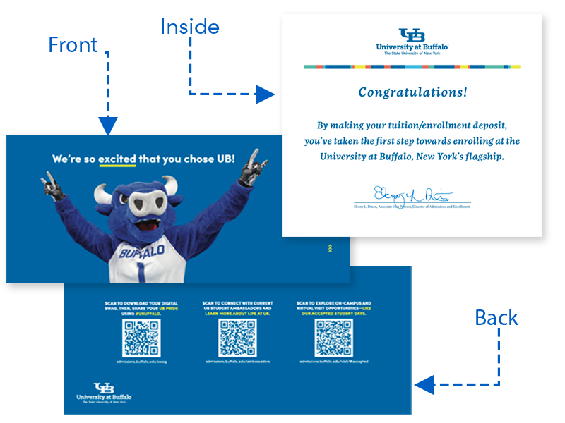
To help encourage students to deposit I created this fold-over card to be inserted in a standard business envelope. Inside, was a congratulatory message and a sheet of UB decals for students to share their excitement. The back featured QR codes enrollment and deposit resources.
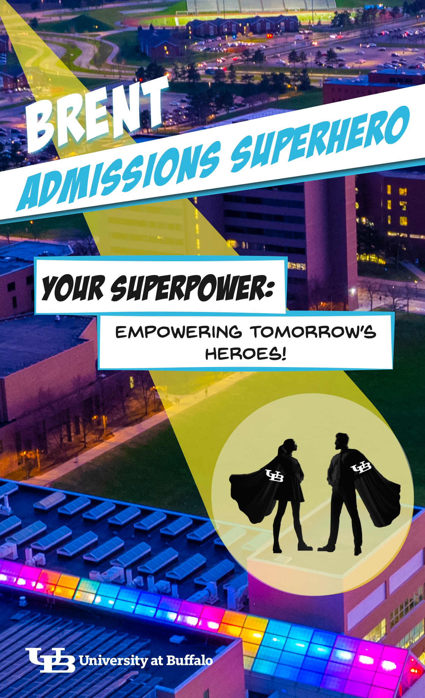
The front of a "Superhero" Poster for admissions team to celebrate their contributions to enrollment efforts. Each poster was customized with the admissions team member's name.
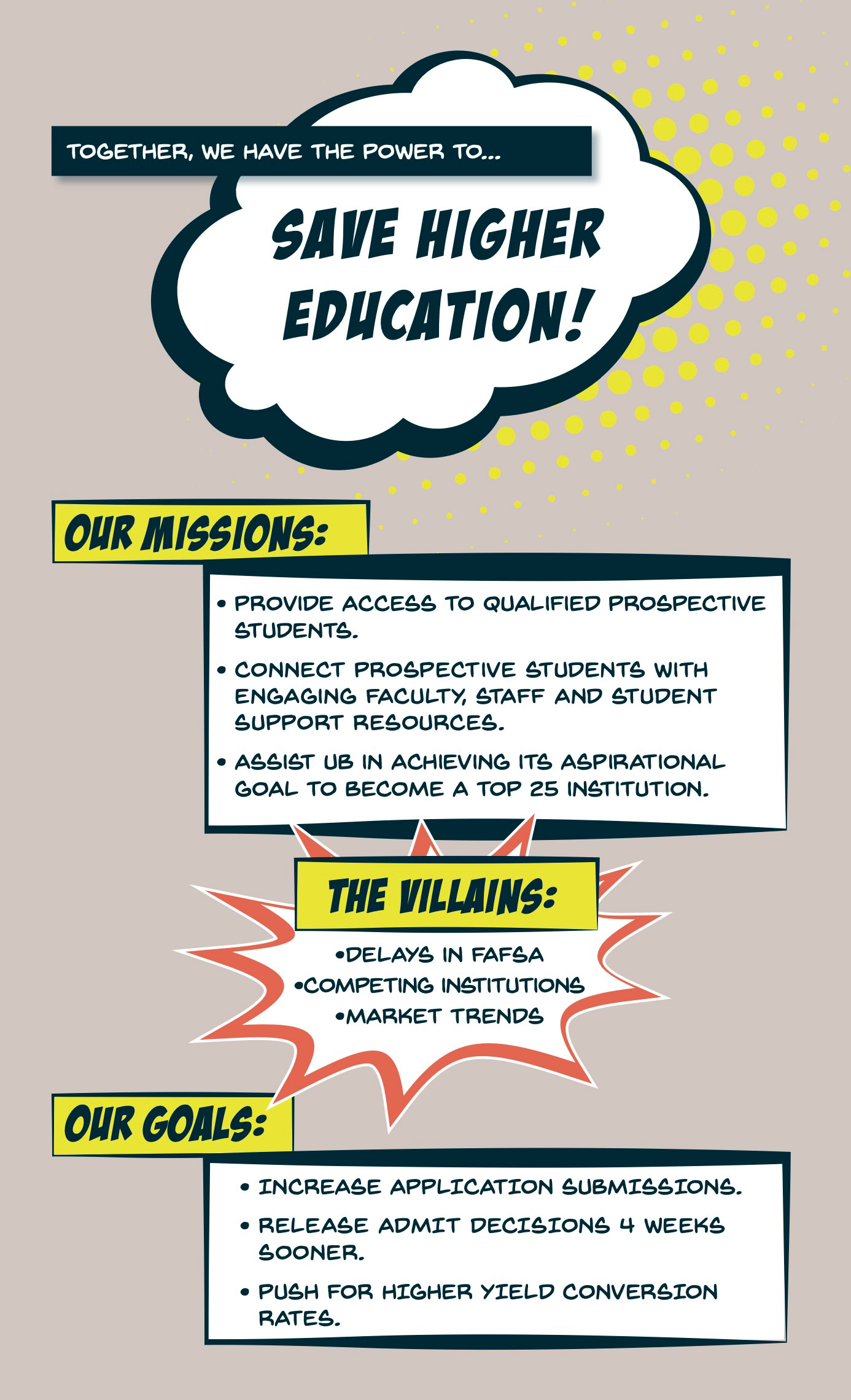
The backside of the "Superhero" poster with the office's plan to increase enrollment.
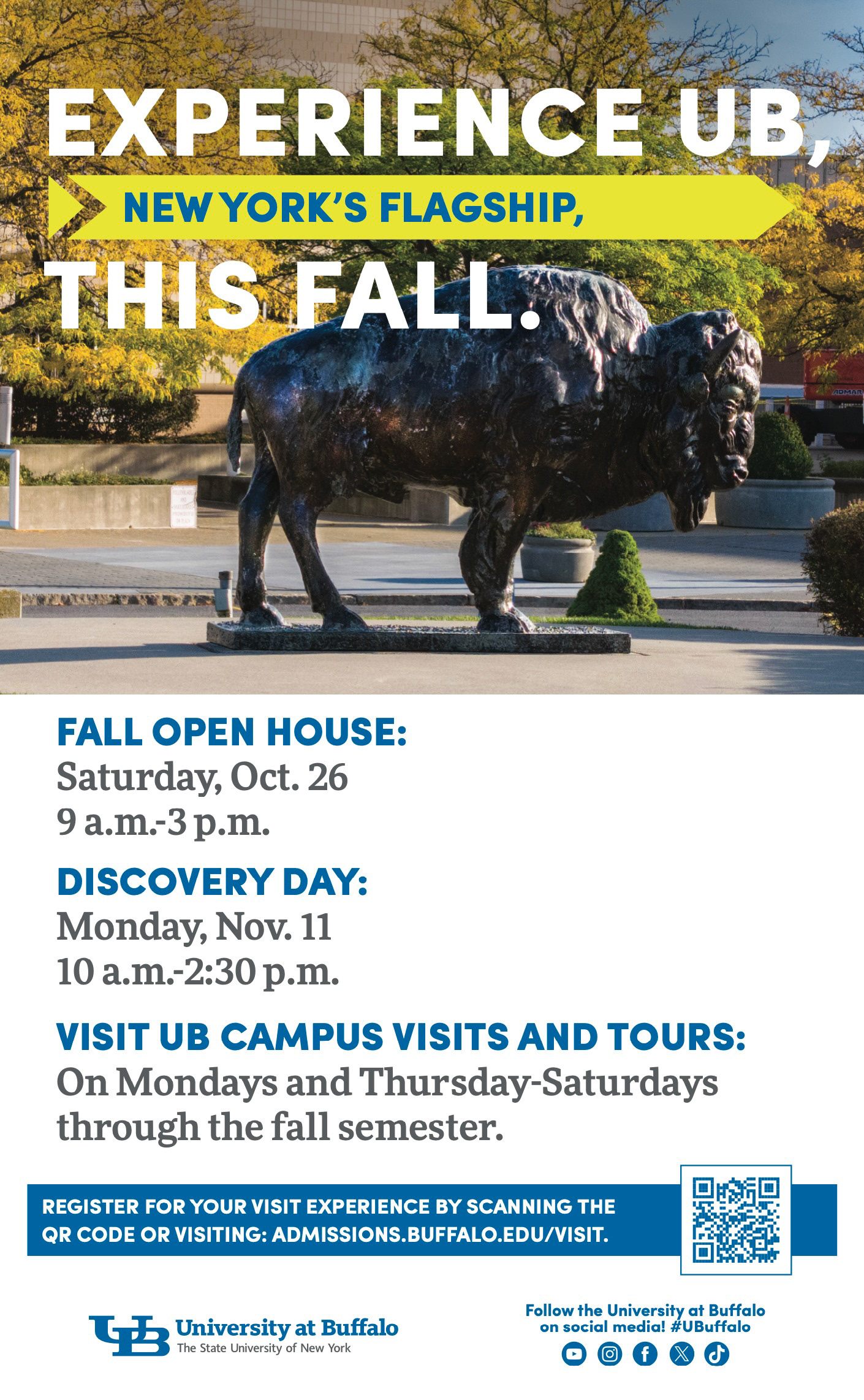
Another new initiative to send high school counselors posters with advertising prospective student events.
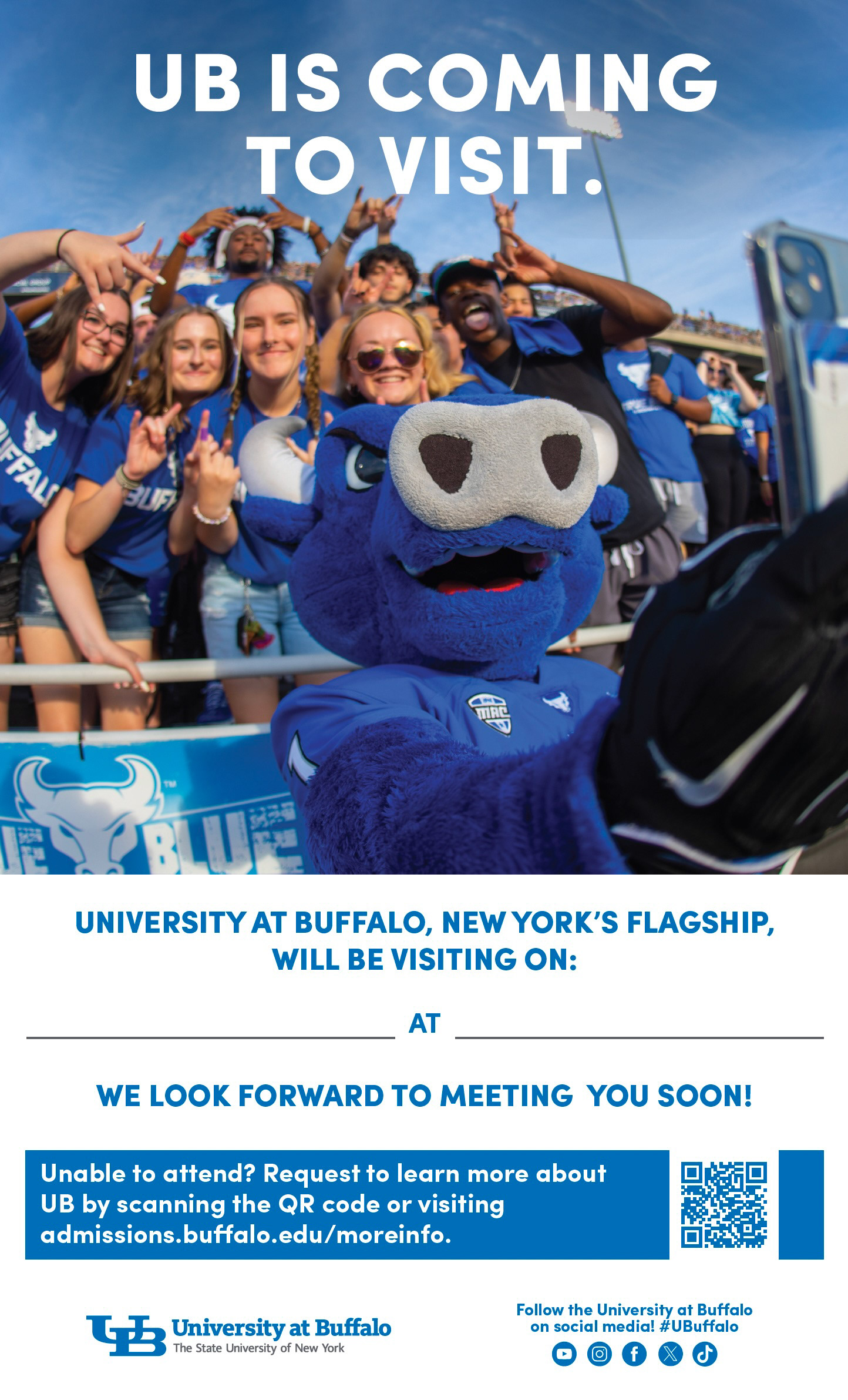
High school visit posters were sent to high school counselors to advertise upcoming visits.
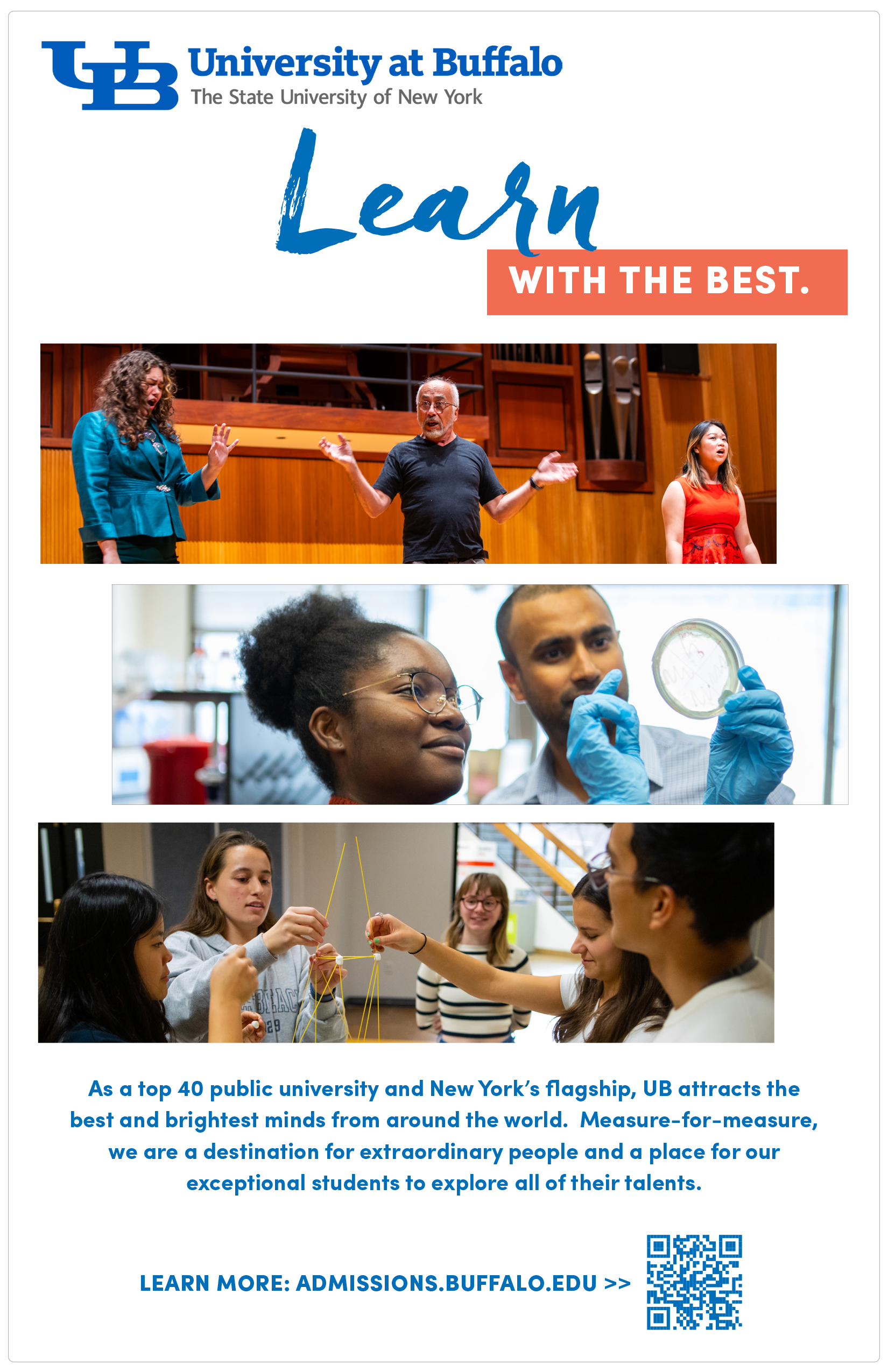
Program ad for an event in the Slee Hall. The layout was intended to have a feel of piano keys.
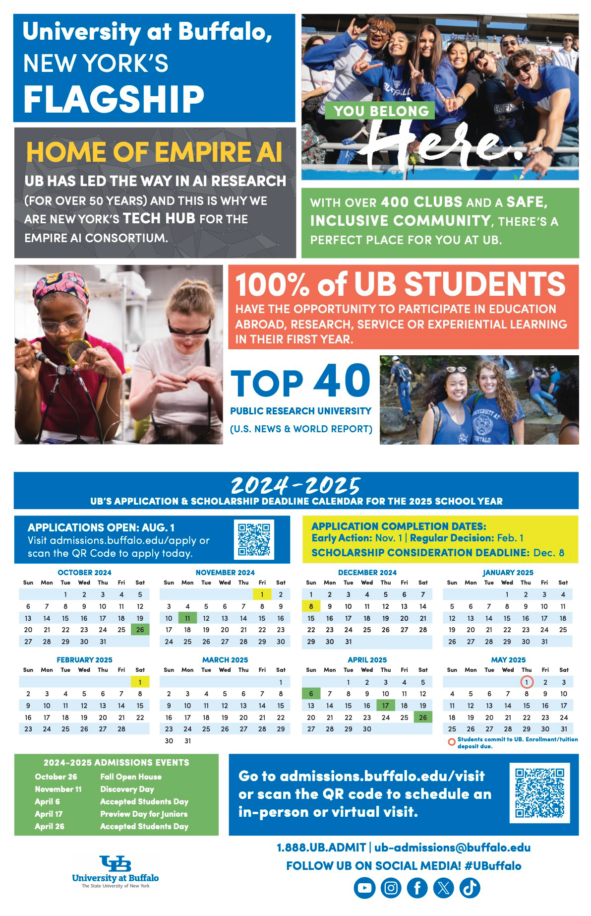
This calendar was created to send high school counselors at the beginning of inquiry season to give them a high-level overview of our pride points and upcoming deadlines. These also were a huge success with admission counselors while out on recruitment.
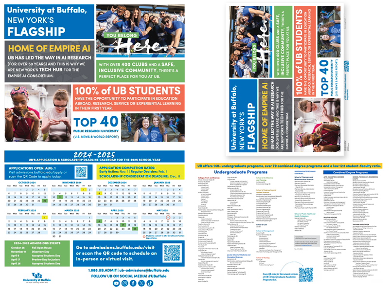
The calendar folded in half for easy mailing and insertion into folders. on the inside is our programs list.
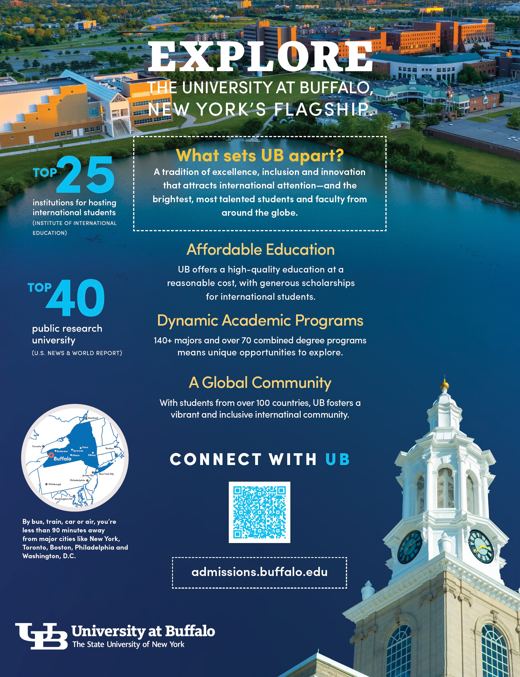
Event program print advertisement for an international recruitment event.
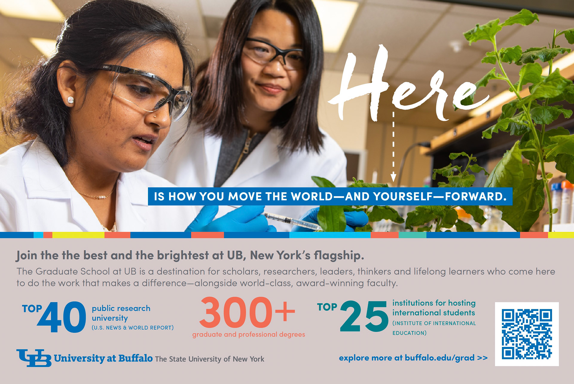
Graduate student recruitment piece for international admissions.
Email Banner Refresh:
A sample of banners that I updated to be more accessible to our audience and communicate a more welcoming experience. In addition to updating the artwork, I had to ensure alt tags and other accessibility considerations were implemented.
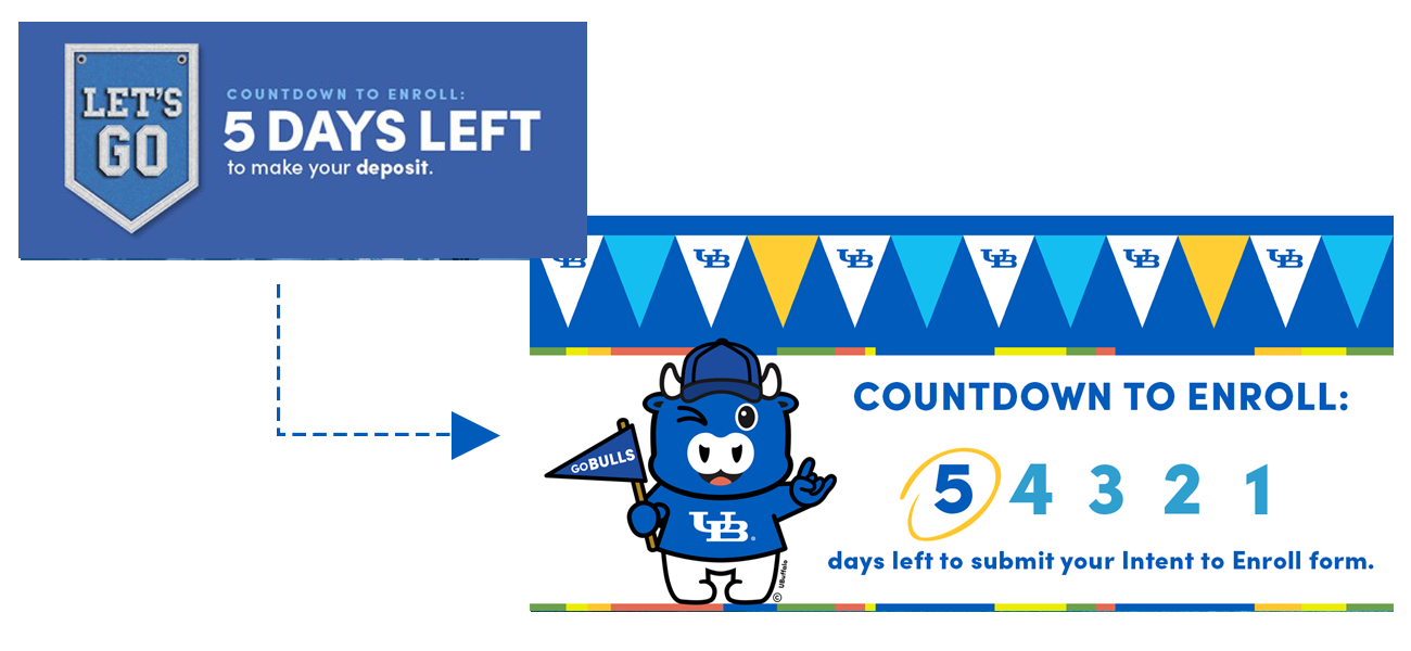
Reimagined the yield countdown banners to incorporate a more exciting feel and welcoming tone with Little Victor, while still creating a sense of urgency with the countdown. A series of messages will be sent with the circle and dark blue number moving progressively.
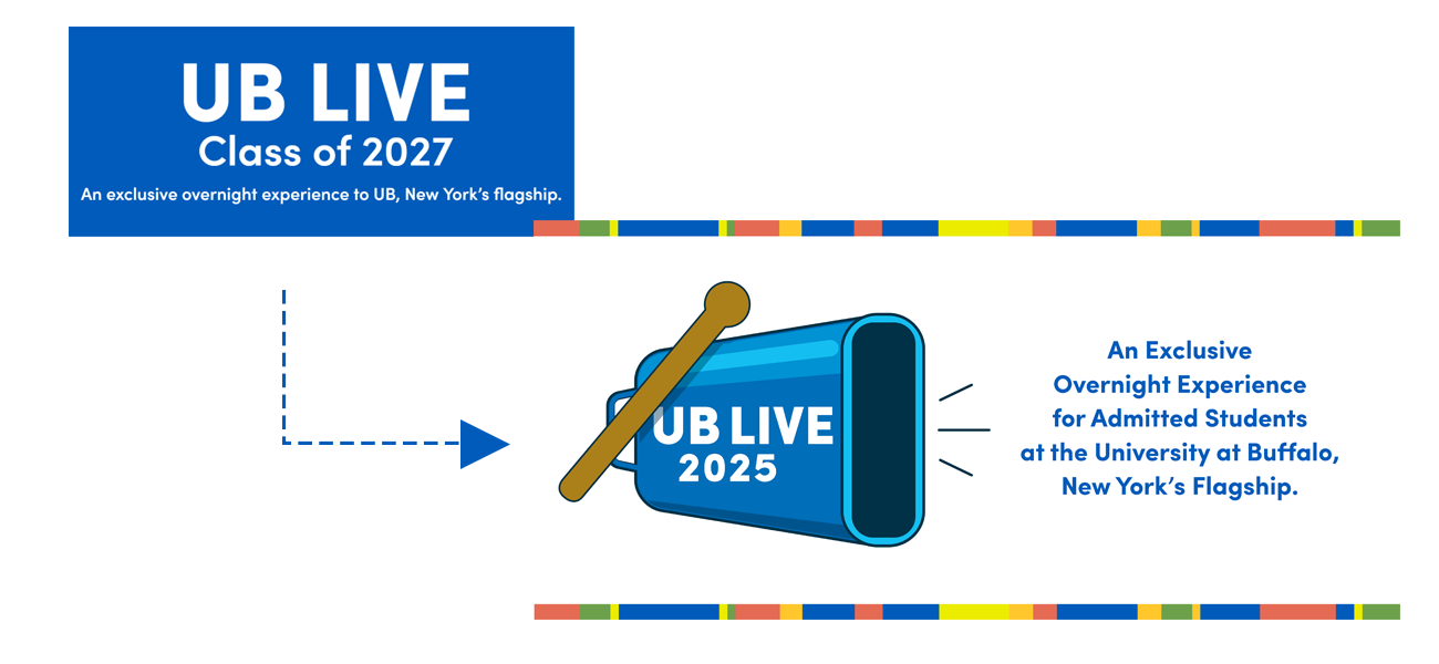
Updated the UB Live hero banner to be in-line with the other collateral created for this event. Also, the team agreed that the year should reference the event year and not the student's graduation year.
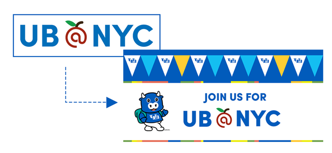
Updated the UB@NYC hero banner to something more relatable to students and that also referenced the digital swag offered to accepted students.
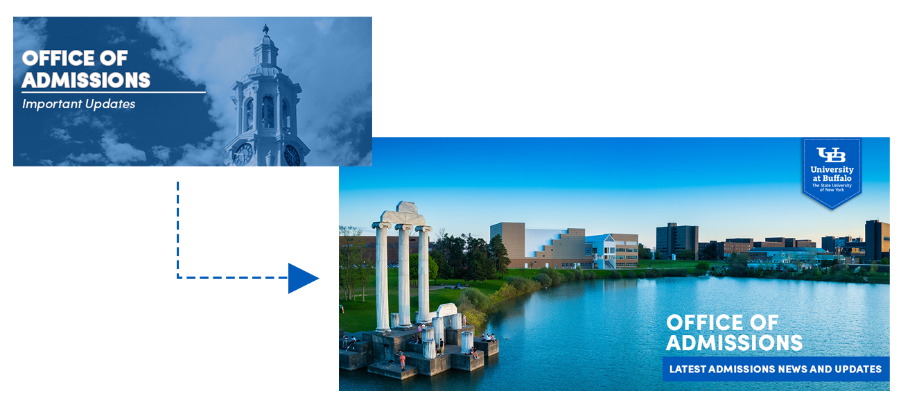
Created a new banner for updates from the Office of Admissions These are generally used to send information to counselors and other support partners.
Email Messaging:
My team and I were charged with elevating the look and content of UB's inquiry, yield, event and anti-melt messages. In addition to communications from the Office of Admissions, I worked with campus partners such as the University Honors College and the Transfer Admissions team to create messaging that engages students and parents. From the time I joined the marketing and communications team, I have improved clarity and consistency of graphics (headers, footers, logos), generated new hero banner graphics that are current, engaging and inline with the UB brand, improved accessibility through alt text and other readability measures (line height of body text, for example).
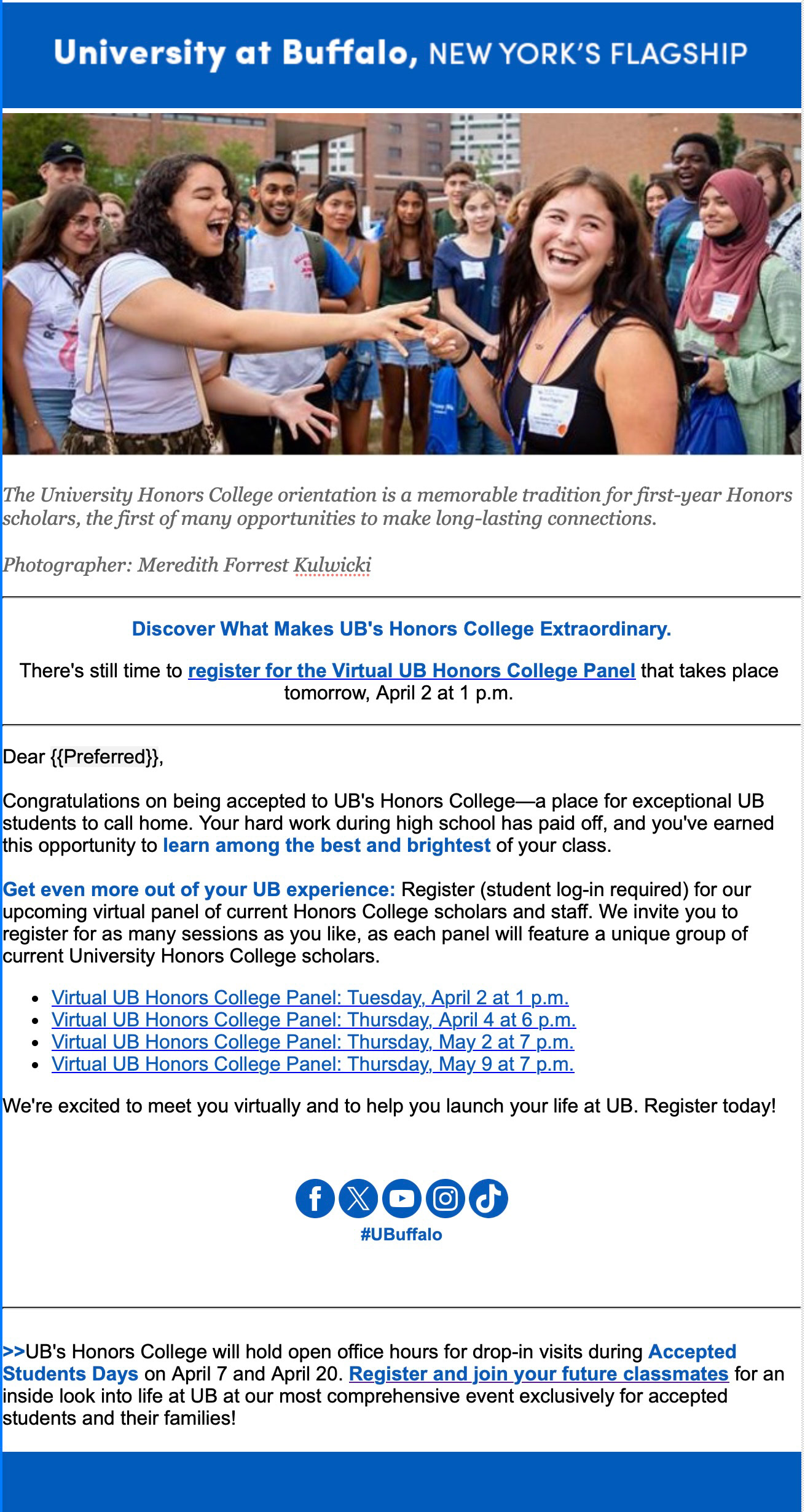
This email was request to push registrations for the University Honors College. The main call to action features an event happening the next day, while the body of email shows other opportunities.
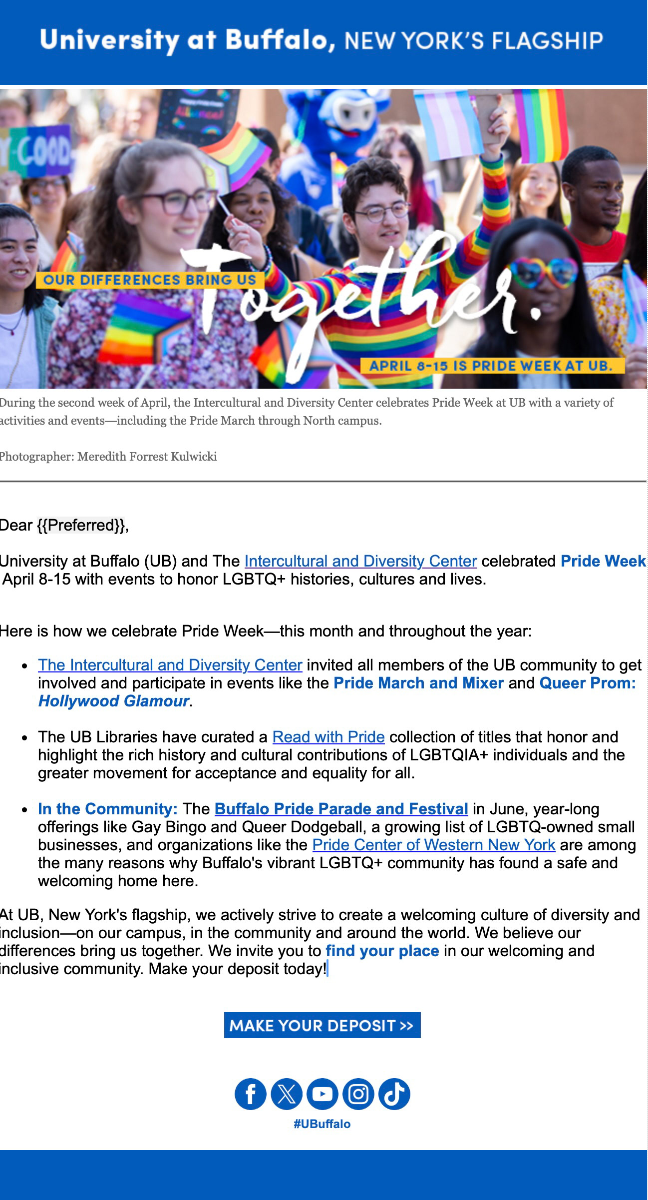
Updated format for heritage month emails with full width images and caption text to explain what is featured in the photo. Additionally, added more campus events (such as library collections) to show more about what UB is doing for DEI.
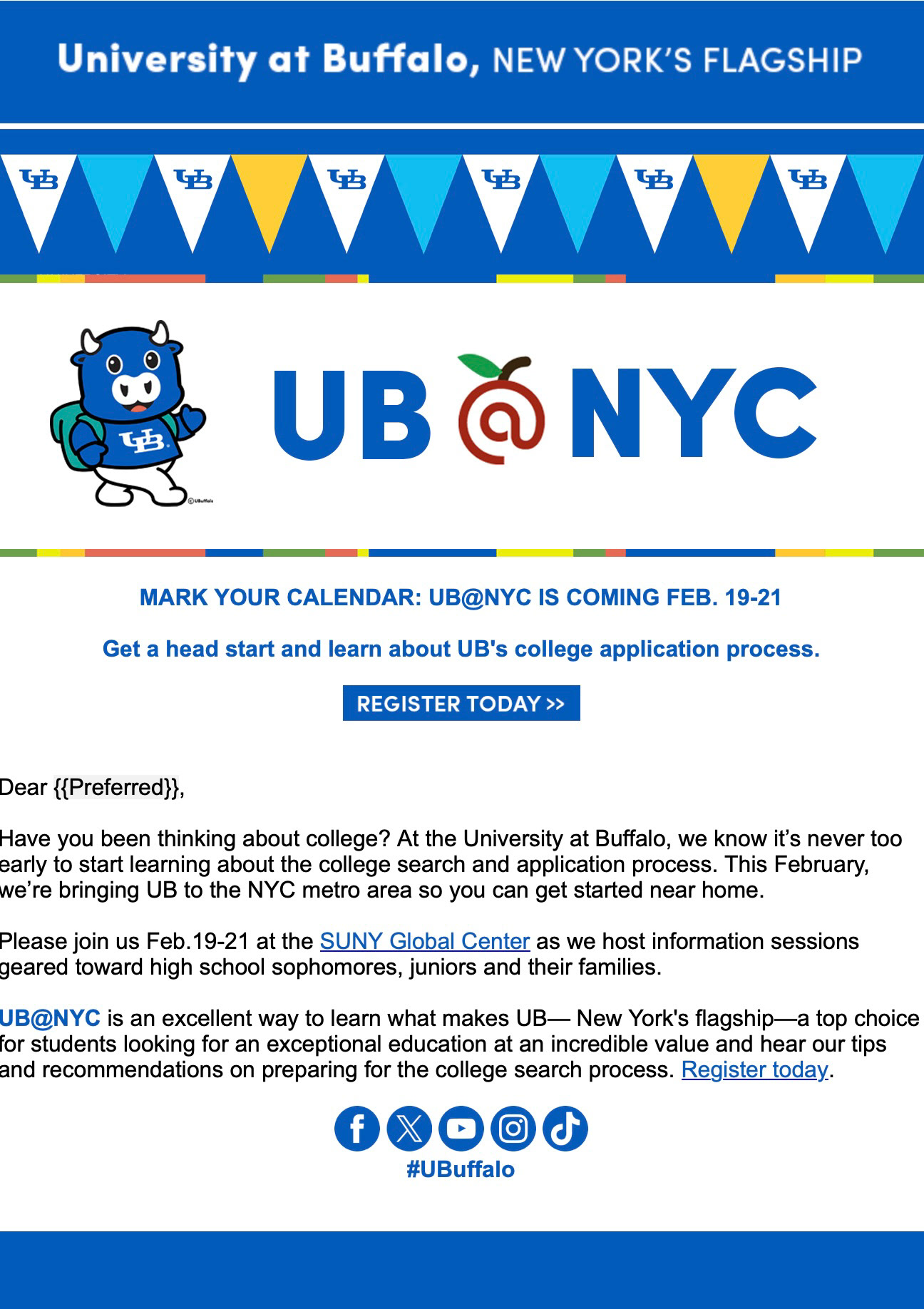
New version of UB@NYC Slate Deliver message incorporating headlines and placing the main call to action on the top. Also, have implemented assigning alt codes and using UB Blue as link and highlight color.
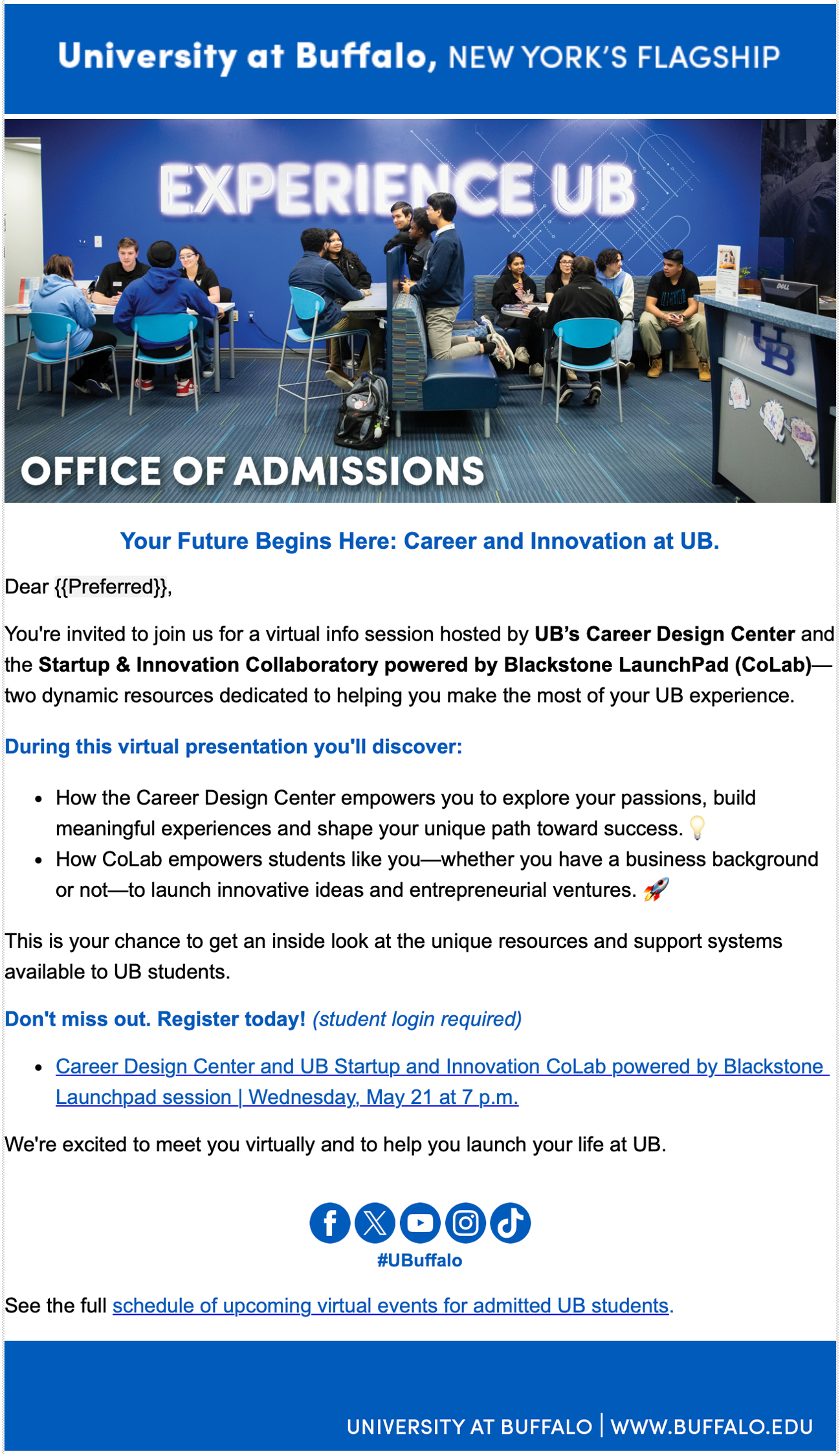
Example of recent shift in using increased line height to improve readability.
Signage:
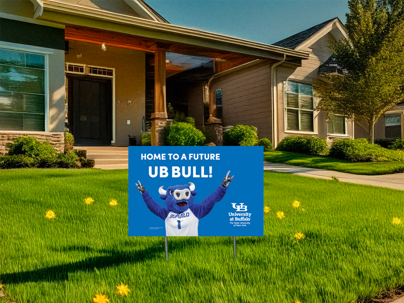
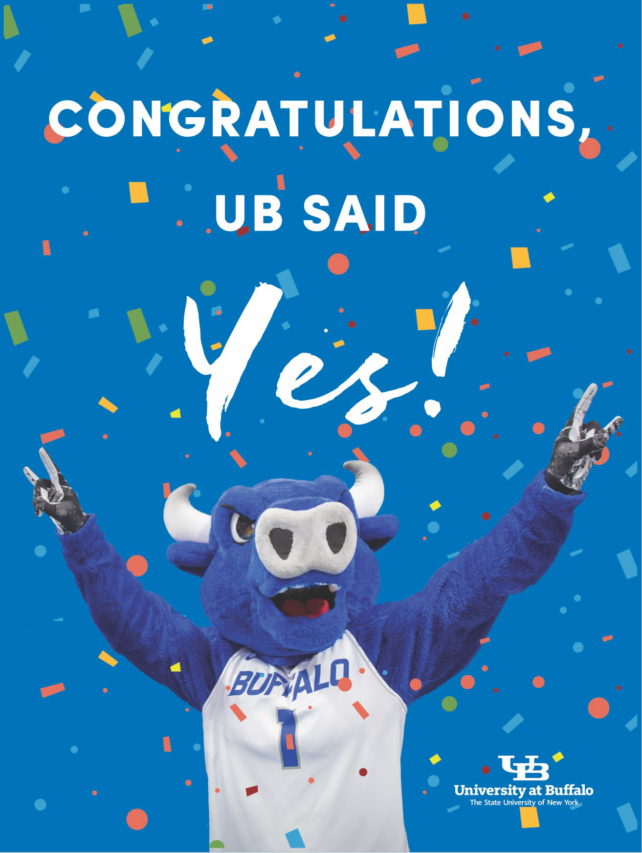
These lawn signs are a new initiative to help students celebrate their acceptance and build affinity with UB.
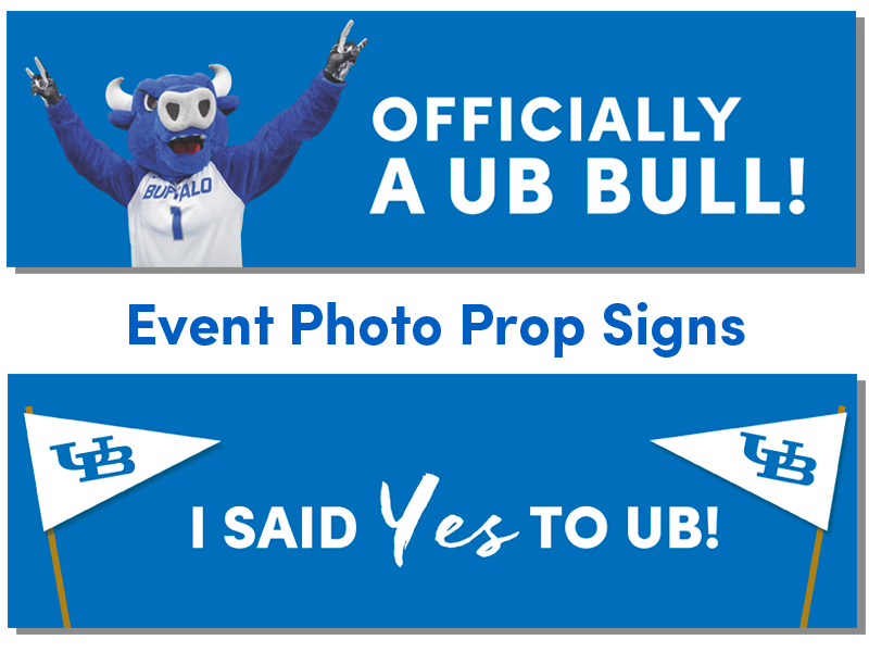
Signs for students to use during accepted student events while they have their picture taken.
